Recognizing a problem in eBay’s iPad app
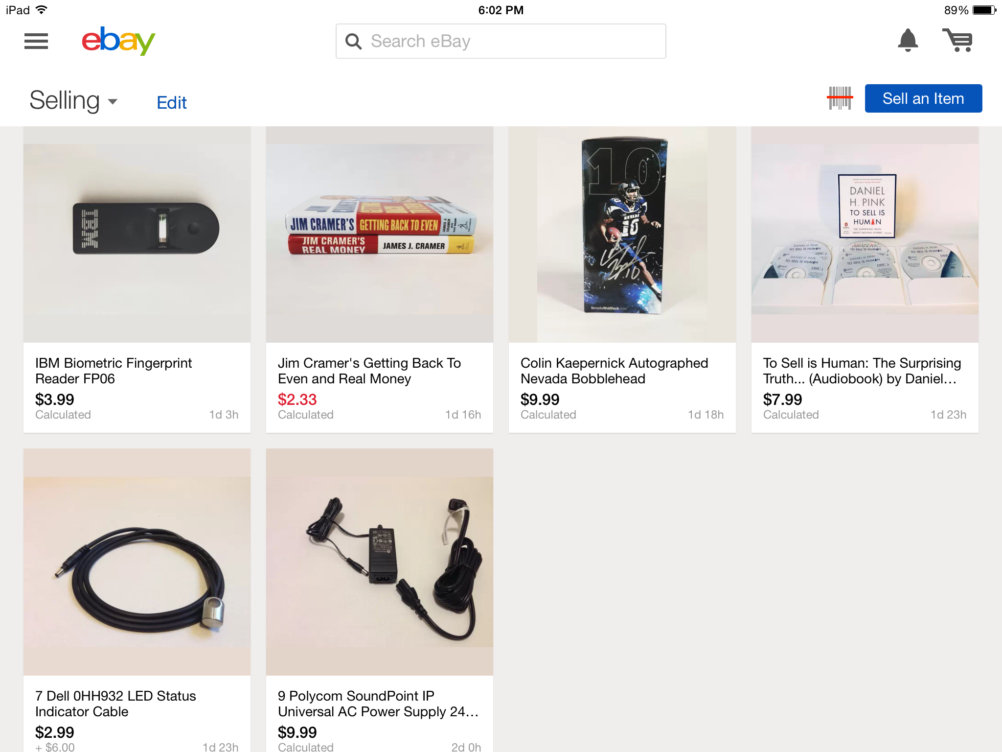
I’ve been buying and selling things on eBay for more than a decade. In the last few years I’ve spent more time using the iPhone app but for some reason I wasn’t using the iPad app. I figured it was time, so I installed the eBay app, logged into my account and went to the selling page to view my active auctions. The photo below is what I saw:
Immediately I recognized a problem.
Do you see it?
On this selling page there is nothing to tell me how many bids each auction item has, assuming they have any, or if any auction will be sold. Another way to look at it: I can’t tell which auction items are going to make me money!
Confusing matters is the use of black and red colors for the current prices. Does red mean the item won’t sell? Does black mean it will? No, that doesn’t appear to be the logic. Only two of my items have bids – the third item (shown in black) and the last auction item (also shown in black). So why do the non-selling items have colors of red and black? Like I said, confusing.
Identifying problems like this can seem obvious when you have sufficient experience with a product (or someone explains it) but even without help there are ways to identify and evaluate problems such as this. All we have to do is find an oracle (a way to recognize a problem) and do some testing (perform an investigation). When reporting and evaluating problems like this I like to use the collection of consistency oracles by James Bach and Michael Bolton. You should be able to follow along fine with the rest of this essay if you’ve never seen list but it’s worth a read.
After evaluating the list of oracles I want to call attention to the ones I think help highlight the problems with the iPad app. The order below is based on my observations of the problem as I came across them. It just happens the evidence becomes stronger and more convincing as we work through the list.
- Inconsistent with user’s desires
- Inconsistent with purpose
- Inconsistent within product
Inconsistent with user’s desires
I think it’s reasonable to expect eBay sellers with current listings, will want to know how many of those listings have bids and if they’ve met the minimum criteria for completing the sale including reserve amounts, number of bids, etc. In fact I’d bet that’s one of the most important pieces of information they’d want to see because it’s what I wanted to see.
Wait a minute, can’t a user click on every single auction item and view more details? Yes. Assuming the user is like me and only selling a few items it’s probably a fine work-around. However, what if you’ve listed a hundred or a thousand items like eBay PowerSellers and businesses do? Do you think it’s reasonable to expect them to click on every single auction? I don’t; it defeats the purpose of the selling view.
User desires can be a hard argument to make on its own. Unless we knew eBay valued this as a high-risk area or we found it affected a large number of users, we probably need to do more research to back up our argument.
Inconsistent with purpose
I think the explicit purpose of the selling page is to help eBay sellers monitor auction items and complete sales. In fact this is what I use it for. Typically with auction durations of more than one day I will glance at each listing once per day by going to the selling page (pictured above). When the auction duration gets to be under 24 hours I will visit the page far more frequently.
Additionally by using different colors for the price of an auction that will sell vs. one that won’t, eBay can quickly identify the status of each listing item. For example if green meant an auction would sell and red meant it wouldn’t, I could easily scan through my selling page and implicitly understand how things were going. From there I could make adjustments if needed.
Since the iPad app shows the same color for auctions that will and won’t sell and because I can’t monitor my auction sales at a distance I think the sellers page is inconsistent with it’s purpose. Given my experience with the eBay product as a whole I also know it’s inconsistent with the larger eBay product.
So far we’ve covered two inconsistencies, two ways we can identify the problems I came across. In both I’m arguing, based on my experience, I understand what a user wants (as a user myself) and I understand the purpose of the product. If both of these inconsistencies sound similar that’s ok because in this case they happen to. They won’t always.
Other than my experience I don’t have much data to back up our argument. I could do more research on the product, look for claims, marketing materials, and interviews with experts that would add more evidence to our argument but let’s focus on the last inconsistency.
Inconsistent within product
As I mentioned before I’m a long time eBay user through eBay.com and the iPhone app. Though eBay.com and mobile apps may seem like separate products they are in fact different ways of gaining access (think distribution channel) to the same product, the eBay platform. This means we can look to those channels when thinking about product consistency.
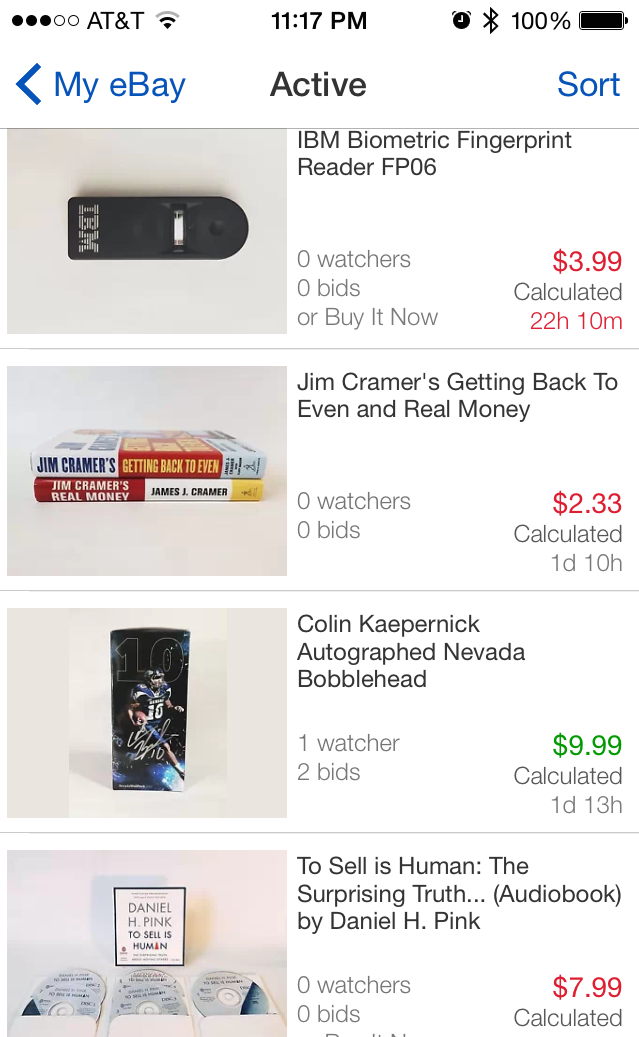
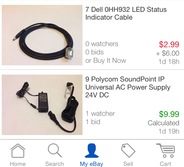
In my mind, even though the iPad app fails to fulfill its users desires and purpose it is most obviously inconsistent with other aspects of the eBay product. Here’s the same seller’s view on the eBay iPhone app:
Observe any differences?
The iPhone version shows a similar layout but with a few important differences:
- The iPhone app lists the number of bids on each listing right away. I don’t have to go to any other detailed view to get this information (also re-affirms it’s importance).
- The current price is color coded in a way that fits with our normal assumptions – green means a listing is going to sell and red means it won’t. This makes it far easier for us to monitor our current auctions at a glance and it fulfills it’s purpose better than the iPad app.
If we were to compare either mobile app to eBay.com, we’d see the sellers page is only consistent with the iPhone app. This is the strongest evidence we’ve found that points to problems with the iPad app. It’s a far more credible argument than the others because it seems likely eBay would want it’s iPad channel consistent with its others (eBay.com and iPhone app). Without doing much additional research we’ve found a way to explain to eBay stakeholders that these problems exist and are bad.
Closing Thoughts
Usually I report problems so they get fixed. Yet identifying, evaluating and then describing a problem in such a way it convinces someone else of its importance isn’t as simple as you might initially think. If I did this well I’ve convinced you, the reader, there’s a problem with the selling page of the iPad app.
Now all I have to do is file the bug with eBay and delete my eBay iPad app. Why delete the app? Well I’ve been trying to sell things on eBay for the past month and given its problems there’s very little value in me using it.
References
- FEW HICCUPS by Bach and Bolton
- Testing Without a Map by Michael Bolton


